Case Study
kit.
branding, logo design, website design, journal design, copy writing, photography
what is kit.?
kit. is a platform that provides people who are recovering from an eating disorder, with the tools they need on their journey to a healthier life. The website connects this group of people with “support buddies” who can offer their time and energy to those who need it.
who is it for?
It is for anyone in recovery; for people who have accepted that they have unhealthy habits and are ready and willing to address them. This site is not here to scare anyone into recovery against their will, it is here for those who are ready to accept help.

Let’s start at the very beginning

I started by creating a moodboard to determine the look and feel for kit.’s brand. I wanted it to be inviting so their audience wouldn’t feel intimidated about exploring the site.


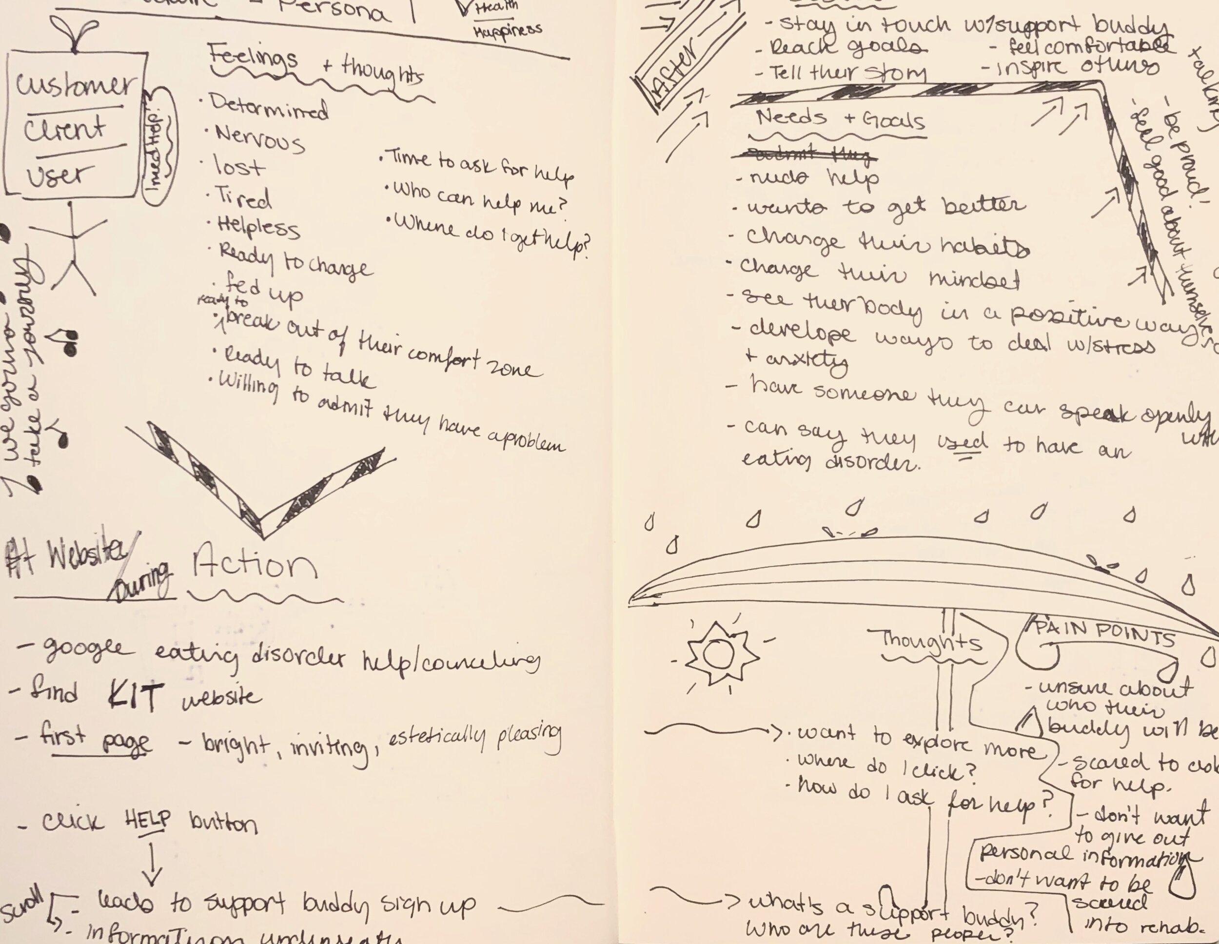
Next, I developed three different personas that I could refer back to when developing the website.

I wanted a bold and fun colour palette. These colours were also picked because the psychology behind them aligned with the purpose of this brand. The following is a description of what each colour is associated with:
Green: balance, stability, safety
Blue: trust, loyalty, inner security
Orange: optimism, independence
Brown: reliability, comfort, honesty
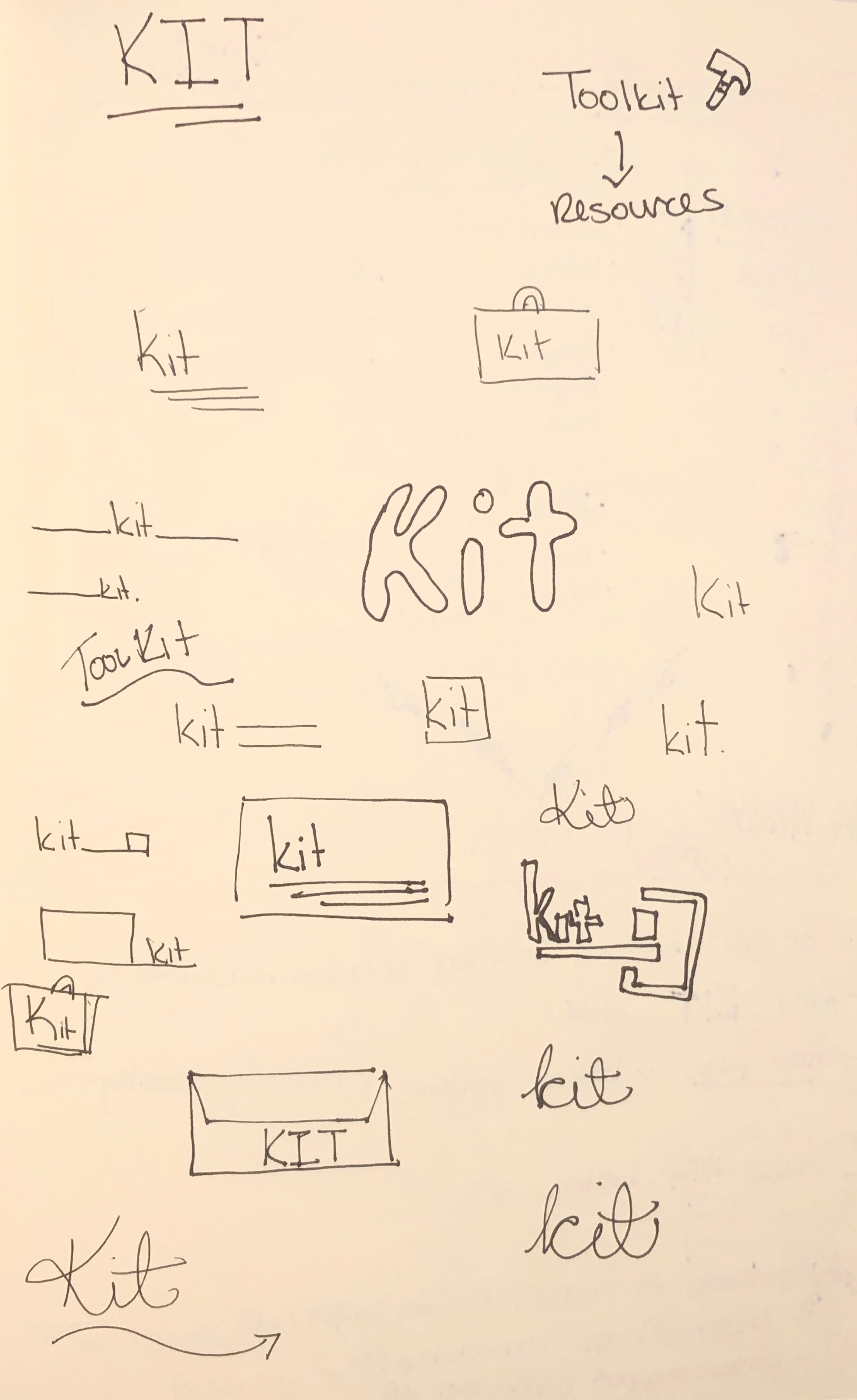
Logo
The name was actually suggested to me by a friend. As I explained the idea to her, she said “you should call it kit, like a toolkit.” Since the site is trying to provide its audience with the tools they need to overcome their disorder, the name made perfect sense.

The journal
I designed this journal spread to prompt the user to reflect on their feelings and goals. There is also blank space for them to write whatever they want. I didn’t want to leave the pages completely blank in case the user isn’t sure what to write about. These prompts will guide them in a direction of self-reflection.
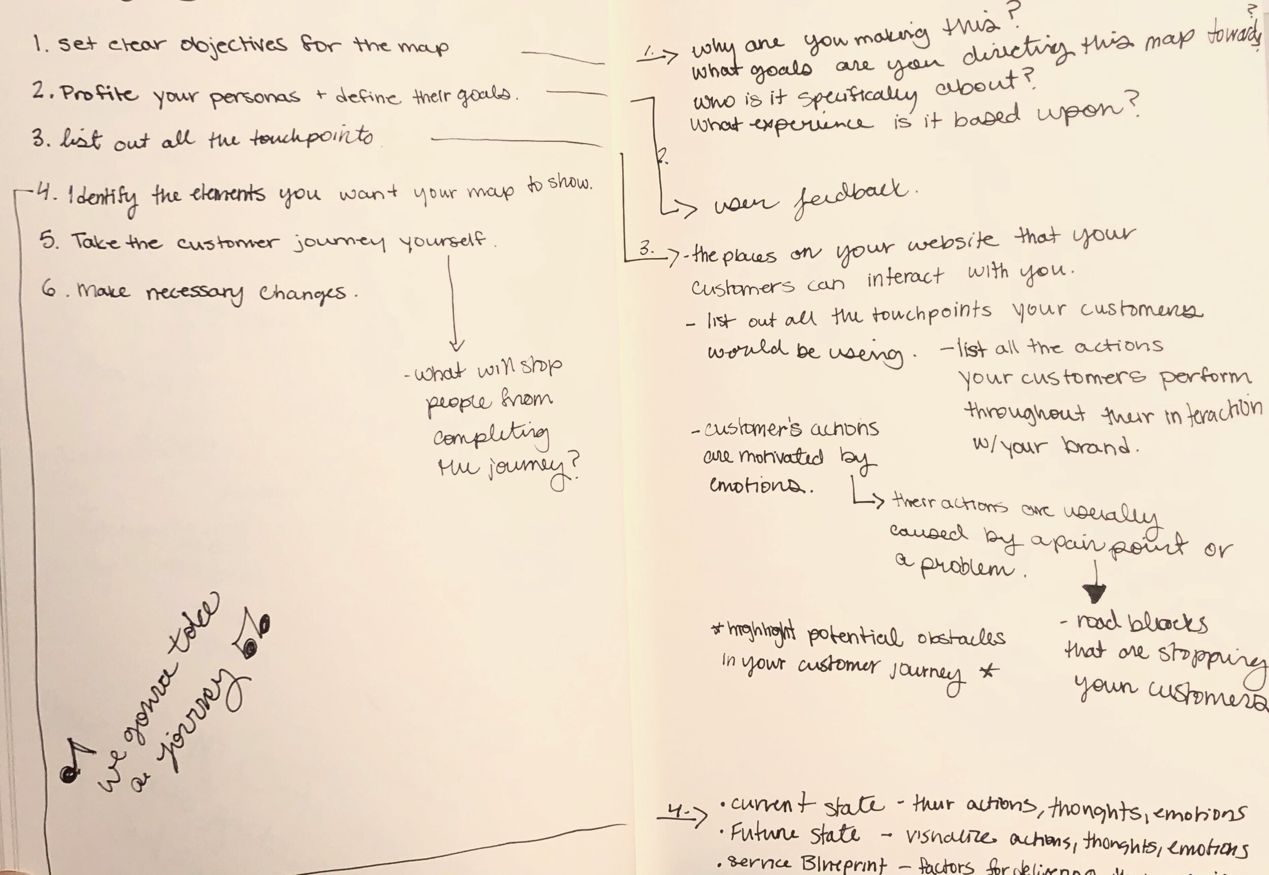
Roughs